
Understanding Responsive Web Design
Defining Responsive Web Design (RWD) in Plain English
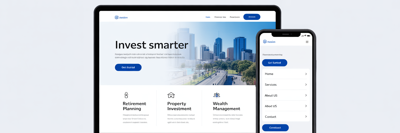
Think of responsive web design like water. It doesn’t matter if you pour it into a tall glass, a wide bowl, or a small cup; it simply adapts to fit the container. In the same way, a responsive website automatically adjusts its layout, images, and text to provide a perfect viewing experience on any device, from a large desktop monitor to a smartphone screen. It’s one website, intelligently built to look great everywhere.
The Old Way vs. The New Way: A Necessary Evolution
Not long ago, businesses tackled the mobile problem by creating two separate websites: the main desktop version and a clunky, stripped-down mobile version, often found at an address like ‘m.yourbusiness.com.au’.
We can all recall the frustration of landing on a mobile site that was missing key features or looked completely different from its desktop counterpart. This approach created a headache for business owners. Every update, whether a price change or a new blog post, had to be done twice. This doubled the workload, increased the chance of errors, and led to an inconsistent brand experience for customers.
The ‘One Codebase’ Advantage for Smart Businesses
Responsive design solves these problems with a simple, powerful principle: one codebase for all devices. This means your website is built on a single set of HTML and CSS files that contain instructions on how to display content on different screen sizes. For a business owner, this translates into tangible benefits.
Maintenance becomes straightforward because you only need to update one site. This efficiency significantly lowers long-term development costs. More importantly, it ensures every customer gets the same professional, consistent brand experience, no matter how they find you. This is why a modern website design for startups and small businesses is built on a responsive foundation. It’s not just about aesthetics; it’s a strategic choice for performance, accessibility, and operational sanity.
| Factor | Old Way (Separate Mobile Site) | New Way (Responsive Web Design) |
|---|---|---|
| Maintenance | Requires updating two separate websites, doubling the workload. | Update one codebase, and all versions are updated instantly. |
| Cost | Higher long-term costs due to duplicated effort in development and updates. | Lower long-term costs and more efficient use of resources. |
| User Experience | Often inconsistent; mobile version may have fewer features or different branding. | Provides a seamless and consistent brand experience on all devices. |
| SEO Performance | Creates duplicate content issues and splits link authority, harming rankings. | Consolidates SEO efforts onto a single URL, preferred by Google. |
Why Your Customers’ Mobile Habits Matter

The Australian Mobile-First Reality
Your customers are not sitting at a desk when they look for you. They’re on a tram rattling through Melbourne, scrolling on their phone while waiting for a flat white in a Sydney cafe, or standing in their backyard in Perth searching for a local tradie. This is the mobile-first reality of Australian commerce.
While global statistics are impressive, the trend is even more pronounced for local services, where the first point of contact is almost always a phone. According to a 2025 analysis from DigiMavrick, mobile devices accounted for about 63% of all web traffic, but for local searches, that number climbs even higher. A mobile friendly website for small business is no longer a nice-to-have; it’s the front door to your business.
The High Cost of a Bad First Impression
What happens when that front door is jammed? A non-responsive website on a mobile device is exactly that. Users are met with text that’s too small to read, images that break the layout, and buttons that are impossible to tap. The immediate reaction is frustration, followed by a swift tap of the ‘back’ button. Research consistently shows that 61% of users will not return to a site they had trouble accessing on mobile. Every one of those users represents a lost sale, a missed lead, and a direct leak in your revenue. You could have the best product or service in your suburb, but if customers can’t navigate your site on their phone, they will never know.
Meeting Modern User Expectations
Today’s customers have little patience for poor digital experiences. They expect websites to be fast, intuitive, and seamless. The moment they have to pinch and zoom to read your ‘About Us’ page or struggle to find your contact number, you’ve introduced friction. This friction does more than just annoy them; it damages your brand’s credibility before they’ve even had a chance to engage with what you offer.
As a result, responsive design eliminates these pain points and ensures your content is always presented clearly and your calls to action are easy to use. By meeting these modern expectations, you show customers that you value their time and attention. For more insights on meeting customer expectations, you can explore the articles on our blog.
The Crucial Link Between Responsive Design and SEO
Decoding Google’s Mobile-First Indexing
For years, business owners focused on how their website looked on a desktop. But Google has flipped the script. With a policy called ‘mobile-first indexing’, Google now primarily uses the mobile version of your website to determine its search rankings. In simple terms, your mobile site is your main site in Google’s eyes.
You could have a stunning, award-winning desktop design, but if your mobile experience is poor, your search visibility will suffer across the board. This shift reflects a broader trend toward prioritising user experience, a point highlighted by industry experts at Gravitate Design. Adopting a mobile-first approach is a core part of any modern digital strategy, and for businesses looking to scale, understanding how this fits into a wider plan, like the one detailed in this strategic blueprint for franchise technology, is essential.
How RWD Solves Major SEO Headaches
So, how does responsive design affect SEO? It directly addresses Google’s preferences. Because a responsive site uses a single URL and the same HTML for all devices, it eliminates the problems that plagued older mobile solutions. There are no duplicate content issues to confuse search engines, and all your valuable backlinks and ‘link juice’ are consolidated to one domain, strengthening your authority.
In addition, Google’s crawlers can index your content more efficiently, as they only need to visit one version of your site. This is why Google has officially stated that responsive design is its recommended configuration for mobile sites. It makes their job easier, and they reward websites that do so with better ranking potential.
The Impact on Local Search Rankings
The connection between responsive design and SEO becomes even more critical for local businesses. Think about the searches that drive your customers: ‘electrician in Bondi’, ‘best coffee near me’, or ’emergency plumber Perth’. These are overwhelmingly performed on mobile devices by people who need an immediate solution. Google understands this. Its algorithm is designed to deliver the most useful and accessible results for these queries.
Consequently, it prioritises websites that offer a flawless mobile experience. Having a responsive web design in Australia means you are directly catering to the behaviour of local searchers, giving you a significant advantage over competitors whose sites are still stuck in the desktop era. It’s a direct investment in capturing high-intent local traffic.
Enhancing User Experience to Boost Retention

How Responsive Design Improves UX
Beyond the technical aspects of SEO, responsive design fundamentally serves to improve website user experience (UX). UX isn’t about code or algorithms; it’s about the overall feeling a person has when they interact with your site. Is it easy? Is it pleasant? Does it feel professional? Google measures this ‘feeling’ with a set of metrics called Core Web Vitals. For a business owner, they can be simplified into three key questions:
Core Web Vitals and Mobile Performance
- How fast does the main content load? (Largest Contentful Paint – LCP): This is the time it takes for the most significant piece of content, like an image or block of text, to appear. A fast LCP reassures the user that the page is working correctly.
- How quickly can a user interact with the page? (First Input Delay – FID): This measures the time from when a user first tries to interact with your page, like clicking a button, to when the browser actually responds. A low FID makes the site feel responsive and not laggy.
- Does the layout shift unexpectedly while loading? (Cumulative Layout Shift – CLS): This measures visual stability. A low CLS score means the page elements don’t jump around, preventing users from accidentally clicking on the wrong thing.
Common Mobile Problems Responsive Design Solves
These metrics have a direct impact on your bottom line. A report from FullPage Agency found that pages passing all three Core Web Vitals thresholds are 24% less likely to be abandoned by users. Responsive design is engineered to perform well against these vitals by loading content efficiently for each device.
Ultimately, a good user experience is about removing barriers. Responsive design eliminates the most common mobile frustrations that stand between a potential customer and a sale:
- Pinching and zooming just to read basic text.
- Buttons and links that are too small for a thumb to tap accurately.
- Forms that are difficult to fill out on a small screen.
- Horizontal scrolling to see the full width of a page.
Each of these small annoyances adds up, creating a negative impression that can drive customers away for good. By providing a seamless experience, you build trust and encourage visitors to stay, explore, and convert. You can use some of our free tools to analyse your current website’s performance and identify areas for improvement.
Practical Principles for a High-Performing Responsive Site
Adopting a ‘Mobile-First’ Design Philosophy
The best responsive sites are built with a ‘mobile-first’ philosophy. This means the design process starts with the smallest screen: the smartphone. By designing for mobile first, you are forced to prioritise what truly matters. You must focus on the most essential content, the clearest calls to action, and the simplest navigation.
Once the core experience is perfected for mobile, you can then progressively enhance the design for larger screens like tablets and desktops, adding secondary features or more complex layouts. This approach ensures your site is lean, fast, and focused on conversion from the ground up.
Designing for Touch: The Thumb Zone is Key
Desktop websites are navigated with a precise mouse cursor, but mobile sites are operated with imprecise fingers and thumbs. A critical aspect of mobile design is creating ‘touch-friendly’ interfaces. This involves understanding the ‘thumb zone’, the area of the screen that is easiest to reach with one-handed use.
Key interactive elements like navigation buttons and calls to action should be placed within this zone. Furthermore, all tappable elements should be large enough to avoid ‘fat-finger’ errors. As noted in web accessibility standards from sources like Olive Street Design, a minimum tap target size of 44×44 pixels is recommended to ensure users can interact with your site without frustration.
Ensuring Readability and Accessibility for All
If users have to squint to read your content, you’ve already lost them. A fundamental principle of responsive design is ensuring text is legible on all screen sizes without requiring the user to zoom in. This means using a font size of at least 16px for body text, which is the default size in most web browsers for a reason.
Good contrast between text and background colours is also essential, not just for general readability but as a core tenet of web accessibility. A readable and accessible site serves all users, including those with visual impairments, and signals a professional, customer-centric brand.
Optimising Images for Speed and Performance
One of the biggest culprits of slow-loading websites is large, unoptimised images. They are often the heaviest elements on a page and can be a major drain on performance, especially on mobile connections. As highlighted by Codivox, unoptimised images can consume 40-70% more data than necessary on mobile devices. A high-performing responsive site uses modern techniques to address this.
This includes serving images in next-gen formats like WebP, which offer superior compression, and using responsive image code that automatically delivers the appropriate image size for the user’s device. This ensures fast load times without sacrificing visual quality, all supported by a reliable infrastructure like our high-performance cloud hosting.
Connecting Responsive Design to Your Bottom Line

Driving Conversions with Mobile Optimisation
A seamless mobile experience isn’t just about making customers happy; it’s about guiding them toward a purchase. When your website is optimised for mobile, every step of the customer journey is simplified. Forms are easy to fill out, ‘click-to-call’ buttons let users contact you with a single tap, and checkout processes are streamlined.
The impact on your business is direct and measurable. A study cited by WebsiteDigitals found that optimising critical user actions on mobile can increase lead conversion rates by over 40%. Responsive design turns your website from a passive brochure into an active sales tool that works for you 24/7.
Protecting Your Marketing Investment
Think about the money you spend on marketing, whether it’s Google Ads, social media campaigns, or local flyers. Every dollar is spent with the goal of driving potential customers to your website. If that website offers a poor mobile experience, you are essentially paying to lead people to a locked door.
They arrive, get frustrated, and leave immediately. This high bounce rate tells search engines your site isn’t relevant, further harming your organic rankings. A responsive website ensures that every dollar you invest in marketing has the best possible chance of delivering a return. It makes your entire marketing ecosystem more efficient and effective.
Building Brand Trust and Credibility
In the digital age, your website is often the first interaction a customer has with your brand. A clunky, outdated, or broken mobile site sends a clear message: this business is not modern, professional, or customer-focused. It erodes trust before you’ve even had a chance to showcase your expertise.
Conversely, a website that is fast, beautiful, and easy to use on any device builds instant credibility. It signals that you care about the details and are invested in providing a quality experience. This positive first impression fosters loyalty and, as we’ve seen, keeps users from becoming part of the 61% who never return. By investing in a professional online presence with a platform like Digital Fusion Hub, you are investing in the long-term health and reputation of your brand.
Choosing Your Path to a Winning Website
Recap: RWD is No Longer Optional
As we’ve explored, a responsive website is fundamental to modern business success. It’s essential for reaching customers where they are, ranking on Google, and ultimately, driving sales. For any Australian startup or small business, having a professional, mobile-friendly online presence is not a luxury; it’s a baseline requirement for competing in today’s market.
Evaluating Your Options as a Small Business
When it comes to building that website, business owners typically face a dilemma. The DIY route, using template builders, can seem affordable but often comes with a steep learning curve, technical limitations, and a significant time commitment. On the other hand, hiring a traditional web design agency or freelancer can be expensive, with costs quickly adding up for hosting, maintenance, and marketing support. For a small business, neither option is ideal.
The Smart Choice: An Integrated Platform
There is a better way. An all-in-one platform like Digital Fusion Hub offers the perfect solution for busy Aussie entrepreneurs. We combine professional website design for startups with secure hosting, marketing tools, and ongoing support under one roof.
This integrated approach saves you time, reduces costs, and eliminates the headache of juggling multiple vendors. You get a high-performing, responsive website without the technical burden, allowing you to focus on what you do best: growing your business. If you’re ready to build a digital presence that works as hard as you do, get in touch with us today.