The Hidden Costs of a Cluttered Website
Think of your website as your digital shopfront. Now, picture a physical store with flashing lights in the window, music blaring from three different speakers, and promotional flyers scattered all over the floor. You would probably turn around and walk out. Many small business websites create this exact same feeling of overwhelming chaos online, and it comes with significant hidden costs.
Identifying the Overstuffed Digital Shopfront
An overstuffed digital shopfront is easy to spot. It’s the website that greets you with an immediate pop-up asking for your email, while an auto-playing video starts in the corner and a chatbot slides into view. The navigation menu has a dozen dropdowns, and the homepage is a patchwork of competing colours, fonts, and calls to action. Every element is screaming for attention, which means nothing truly gets it. This visual noise doesn’t communicate value; it creates a barrier between you and your potential customer.
The Direct Impact on User Patience and Bounce Rates
When faced with too many choices, the human brain often defaults to making no choice at all. This is known as decision fatigue. A visitor landing on a cluttered page is forced to process an enormous amount of information just to figure out where to click. That moment of hesitation quickly turns into frustration. We’ve all been there: you land on a site looking for a simple answer, get bombarded, and hit the back button without a second thought. That click is a lost sale, a missed lead, and a potential customer who likely won’t return.
Performance Bottlenecks in the Australian Context
This problem is magnified by Australia’s diverse internet landscape. A heavy, feature-packed website might load reasonably well for someone on a high-speed NBN connection in a Sydney CBD office. But what about your customer in regional Queensland on a less reliable network, or someone in rural Western Australia trying to browse on their mobile? For them, that same bloated website becomes a slideshow of half-loaded images and unresponsive buttons. By designing a site that demands a perfect connection, you are unintentionally telling a huge portion of the Australian market that their business isn’t welcome.
Eroding Trust and Professionalism
Beyond the practical issues, a cluttered website quietly erodes trust. A disorganised digital presence can make a business seem unprofessional, or worse, desperate. It suggests a lack of confidence in the core product or service, as if the business feels the need to throw everything at the wall to see what sticks. Just as you would trust a clean, well-organised workshop over a messy one, customers subconsciously link visual clarity with credibility. These are some of the most critical small business website design tips to consider: your design is shaping perceptions before a visitor even reads a single word about what you do.
Defining True Minimalist Web Design
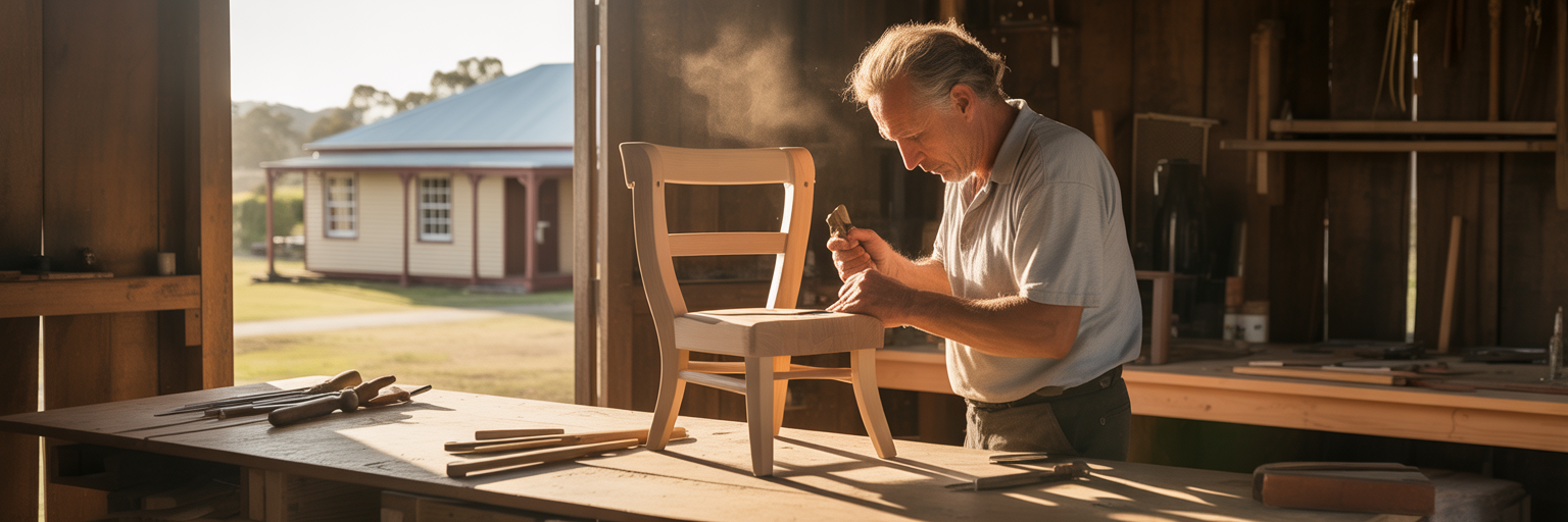
After seeing the problems caused by digital clutter, it’s easy to think the solution is just to remove everything. But true minimalist design isn’t about creating empty, sterile pages. It’s about intentionality. It’s the difference between a cluttered garage and a master craftsman’s workshop, where every tool is perfectly placed and serves a distinct purpose. Nothing is there by accident.
Beyond Emptiness: Minimalism as Intentionality
Minimalism in web design means that every single element on the page must justify its existence. Before adding a button, an image, or a line of text, you must ask: “Does this help the user achieve their goal?” If the answer is no, it doesn’t belong. This philosophy of purposeful inclusion ensures that the website is not just clean, but also highly effective. As the Nielsen Norman Group highlights, minimalism is characterised by a high signal-to-noise ratio, where the important information stands out clearly.
The Power of Negative Space (or ‘White Space’)
What you don’t include is just as important as what you do. Negative space, often called white space, is not just “empty” space; it’s an active design tool. It gives content room to breathe, making text more readable and less intimidating. It also creates a visual hierarchy, naturally guiding the user’s eye from one element to the next without the need for flashy arrows or borders. A generous use of negative space communicates sophistication and calm, allowing your key message to land with greater impact.
Strategic Use of Typography and Colour
With fewer graphic elements competing for attention, typography and colour become incredibly powerful tools for building a brand identity. A strong, distinctive font can convey personality, whether it’s modern and clean or traditional and elegant. A limited and strategic colour palette, applied consistently, makes a brand instantly recognisable. This approach to minimalist web design Australia helps local businesses project a polished, professional image that can stand alongside global competitors. This focus on intentional branding is a principle we explore further in our collection of articles.
Function Over Frills: Prioritising the User’s Goal
Ultimately, minimalist design is user-centric. It starts by asking, “What does the visitor want to accomplish on this page?” Whether it’s to find your contact details, understand your service, or buy a product, the design’s primary job is to make that task as simple and frictionless as possible. Every other element is a potential distraction. This principle of function over frills extends beyond the screen. As seen in other design disciplines, even something like a minimalist phone uniform reflects a commitment to clean lines and purpose, reinforcing a brand’s identity through cohesive aesthetics.
Supercharge Your Site Speed and Search Rankings
A minimalist website isn’t just about looking good; it’s a strategic decision that directly impacts your technical performance. By stripping away non-essential elements, you create a lighter, faster, and more efficient digital presence that both users and search engines will reward.
The ‘Less is More’ Approach to Faster Loading
The technical logic is straightforward. Every image, video, script, and stylesheet on your website requires a separate request to the server. A cluttered site can easily have over a hundred of these requests, each one adding to the total load time. A minimalist design drastically reduces this number. Fewer elements mean a smaller total page size and fewer server requests, which is the most direct way to improve website loading speed. As research consistently shows, even a one-second delay in page load time can lead to a significant drop in conversions.
Winning with Google’s Core Web Vitals
Google’s search algorithm now directly measures user experience through a set of metrics called Core Web Vitals. In simple terms, these metrics assess how quickly your page loads (Largest Contentful Paint), how quickly it becomes interactive (First Input Delay), and whether it is visually stable (Cumulative Layout Shift). A minimalist website is naturally built to excel in these areas. With fewer large elements to load and less complex code, it delivers a stable, fast experience that Google rewards with better search rankings. These are some of the most powerful SEO benefits of simple websites, as a good user experience is now a direct ranking factor. As Mavensum points out, minimalist design helps users find what they need faster, which is precisely what Google aims to measure.
The Mobile-First Advantage in the Aussie Market
In Australia, the majority of web traffic now comes from mobile devices. People are browsing your site on the train in Perth, in a cafe in Adelaide, or during their lunch break in Melbourne. On smaller screens and variable mobile networks, a minimalist design is not just an advantage; it’s a necessity. Simple layouts adapt beautifully to different screen sizes without breaking, and their fast load times are crucial for users on the go. A website that is light and easy to navigate on a phone is a website that wins in the modern Australian market.
Reduced Hosting Demands and Lower Costs
An often-overlooked benefit is the impact on your bottom line. A lighter website uses fewer server resources like bandwidth and processing power. This translates directly into lower hosting costs, a particularly important consideration for startups and small businesses managing a tight budget. Choosing a minimalist design is a financially savvy move that ensures your money is spent on growing your business, not on supporting a bloated website. Of course, this efficiency is maximised when paired with our robust and reliable cloud hosting solutions designed for performance. As Schulze Creative explains, there is a clear connection between minimalist design, speed, and sales.
| Metric | Typical Cluttered Website | Minimalist Website |
|---|---|---|
| HTTP Requests | 100+ | Under 30 |
| Total Page Size | 3 MB+ | Under 1 MB |
| Core Web Vitals Score | Often ‘Needs Improvement’ or ‘Poor’ | Typically ‘Good’ |
| Mobile Load Time (Average 4G) | 5-10 seconds | 1-3 seconds |
| Conversion Impact | Potential drop of 7% per second of delay | Optimised for faster user action |
Note: These figures are illustrative averages. Actual performance depends on specific implementation, but the trend holds true: fewer elements lead to a lighter, faster, and more SEO-friendly website.
Creating a Smoother Journey for Your Customers
Beyond the technical metrics of speed and SEO, a minimalist design fundamentally transforms the way customers interact with your business. It creates a smoother, more intuitive journey by removing friction and focusing on clarity. This commitment to a better user experience design is what turns casual visitors into loyal customers.
Reducing Cognitive Load for Clearer Decisions
Cognitive load refers to the mental effort required to use a website. A cluttered site with competing messages and a confusing layout forces the user’s brain to work overtime just to make sense of it all. This mental strain creates uncertainty and hesitation. A minimalist design does the opposite. By presenting only the most essential information in a clear, organised way, it reduces cognitive load. This allows customers to quickly understand your value proposition and make a confident decision, whether it’s to sign up, make a purchase, or contact you.
Guiding the Eye with Visual Hierarchy
A well-executed minimalist layout acts as a subtle roadmap for the user’s attention. It uses visual hierarchy—the strategic use of size, colour, and placement—to guide the eye to the most important elements in a deliberate order. The headline comes first, followed by a key benefit, and then a clear call-to-action. There are no distracting sidebars or pop-ups to derail the journey. This guided path ensures that your message is received as intended and that users are gently led towards the action you want them to take.
The Power of a Single, Focused Call-to-Action
One of the core tenets of effective minimalist design is the “one page, one goal” principle. Instead of overwhelming visitors with multiple competing requests (“Follow us!”, “Read our blog!”, “Buy now!”), each page is designed around a single, primary call-to-action (CTA). This singular focus eliminates confusion and makes it crystal clear what the next step is. As MediaOne Marketing notes, this level of focus can boost engagement significantly. When the path forward is obvious, conversion rates naturally increase.
Enhancing Readability and Content Consumption
In a minimalist design, your content becomes the hero. With fewer visual distractions, the words on the page carry more weight. Ample white space, clean typography, and short paragraphs make your message easier to read and digest. This is crucial for any business that needs to communicate important information, explain a complex service, or tell a compelling brand story. An ideal user journey on a minimalist page might look like this:
- Arrival: The user lands on a page with a clear, compelling headline that confirms they are in the right place.
- Understanding: They easily scan a few key benefit statements, supported by clean visuals and ample white space.
- Trust: A single, powerful testimonial or trust signal reinforces your credibility without cluttering the page.
- Action: The user’s eye is drawn to a single, obvious call-to-action button that completes the page’s goal.
This seamless flow is only possible when the design gets out of the way and lets the user focus. Building such an intuitive journey is a core part of the professional web development services we offer.
Building Brand Trust with Clean Aesthetics
The design of your website does more than just present information; it communicates your brand’s character. A clean, minimalist aesthetic sends a powerful message of confidence, honesty, and professionalism, helping you build trust with customers before they even read a word.
Equating Simplicity with Professionalism and Confidence
A simple, uncluttered design projects an aura of confidence. It implies that your product or service is so strong that it doesn’t need flashy gimmicks or exaggerated claims to prove its worth. Think about high-end brands; they rarely shout. Their confidence is quiet and self-assured. A minimalist website adopts this same posture, telling visitors that you are a professional organisation that is secure in the value you provide. This perceived professionalism makes customers more likely to trust you with their business.
Clarity as a Form of Honesty
A cluttered website can feel like it’s hiding something in the fine print. Confusing navigation and distracting elements can make customers wary. In contrast, a minimalist layout is inherently transparent. With a clear structure and straightforward presentation, there is nowhere to hide confusing terms, unexpected fees, or misleading information. This clarity is a form of honesty. It shows respect for the customer’s time and intelligence, fostering a sense of security and making them feel more comfortable engaging with your brand.
Standing Out in a Noisy Digital Marketplace
The internet is a noisy place. Most websites are vying for attention with bright colours, moving elements, and constant pop-ups. In this environment, a calm, elegant, and focused website doesn’t just blend in; it stands out. Minimalism acts as a powerful differentiator. It cuts through the digital noise and creates a memorable experience that positions your brand as modern, sophisticated, and thoughtful. This distinction is what helps you capture and hold the attention of your ideal customers.
Broad Applicability Across Industries
Minimalism is not just a style for tech startups or design agencies. Its principles of clarity, focus, and confidence are universally effective. As this guide to successful minimalist websites shows, this approach is incredibly versatile. It can be applied by any Australian small business to build a trustworthy brand, whether you’re a local tradie, a boutique retailer, or a professional consultant. Consider these examples:
- Apple: Uses vast white space and high-quality product imagery to make its technology feel both premium and approachable. The focus is entirely on the product.
- Airbnb: Simplifies the complex process of booking a stay with a clean search interface and a clear, step-by-step process, building trust through ease of use.
- Content Sites: Many popular blogs and news sites use minimalist layouts to prioritise readability, making their content the star of the show.
Each of these examples uses simplicity to achieve a different goal, proving that a clean aesthetic is a powerful tool for any business. You can explore some of our free tools to start shaping your own brand’s visual identity.
Putting Minimalist Principles into Practice

Understanding the benefits of minimalism is the first step. The next is applying these principles to your own website. This doesn’t have to mean a complete overhaul overnight. It can start with a simple audit and a shift in mindset, leading to gradual but impactful improvements.
Conducting a ‘Clutter Audit’ of Your Current Site
Take an honest look at your current website, page by page. For every single element—every image, button, link, and block of text—ask yourself a few tough questions. This is one of the most effective small business website design tips you can implement today.
- Does this element serve a clear purpose for the user?
- Does it directly support the main goal of this page?
- If I removed this, would the user’s experience be worse?
- Is this element here for my benefit or the customer’s?
Be ruthless. You will likely find that a significant portion of your website’s content is just noise. Identifying it is the first step to clearing it out.
Adopting the ‘Less But Better’ Mindset
Once you’ve identified the clutter, adopt the philosophy of “less but better.” Instead of ten average-quality photos, choose one stunning, high-resolution image that tells a story. Instead of five paragraphs of generic text, write one concise, powerful paragraph that gets straight to the point. This applies to everything from the number of items in your navigation menu to the number of social media icons in your footer. Focus on quality over quantity in every aspect of your design and content.
Avoiding the ‘Boring’ Trap: Injecting Personality
A common fear is that a minimalist website will be boring. This only happens when minimalism is mistaken for emptiness. A truly minimalist site can be full of personality. You can achieve this without adding clutter by:
- Using bold typography: A unique and expressive font can become a core part of your brand identity.
- Choosing a distinctive colour palette: A limited but striking colour scheme can make your site memorable.
- Crafting a strong brand voice: The words you use are a powerful design element. Your copy can be witty, warm, authoritative, or quirky, injecting personality into the clean layout.
Knowing When to Call in the Experts
While the principles of minimalism are simple, executing them effectively requires expertise in design, user experience, and technical performance. For busy small business owners, trying to do it all yourself can lead to frustration and a site that doesn’t quite hit the mark.
If you want to get it right without the guesswork, partnering with an all-in-one digital platform is the most efficient path forward. At Digital Fusion Hub, we specialise in creating beautiful, high-performing websites that are designed to grow your business. If you’re ready to transform your digital presence, we’re here to help. Feel free to get in touch with us today to start the conversation.