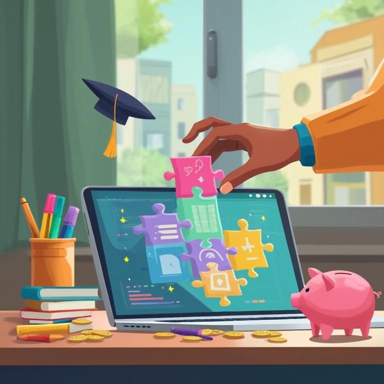

The Shift to AI-Driven personalisation
As a result, the rapid expansion of e-commerce across Australia has fundamentally changed customer expectations. It’s no longer enough to just have an online presence. For a competitive Aussie business in 2026, the conversation has moved beyond simple customization to true AI-driven personalisation. Think of it like the difference between a cashier who remembers your name and a dedicated personal shopper who anticipates your tastes before you even walk into the store. This is about creating a digital experience that feels uniquely tailored to every single visitor, in real time.
In fact, this level of personalisation goes far beyond inserting a customer’s first name into an email. We’re talking about dynamically altering the entire user journey. The content they see can change based on their behavior. The layout and product recommendations can change too. It’s a fluid, responsive environment built for one person at a time. This is the core of modern AI website personalisation, turning a static digital brochure into a living, breathing sales tool.
How AI Personalisation Works
So, how does it work? Behind the scenes, sophisticated algorithms are constantly analyzing a stream of behavioral data. Every click, the depth of a scroll, the time spent hovering over an image, and the path taken through the site all become valuable data points. Over time, these actions build a unique profile for each visitor. The AI can then understand their intent and preferences. This isn’t a one-off setup. It’s a continuous process of automated A/B testing, where the system constantly refines the experience to find what best resonates with different user segments, ultimately maximizing conversions.
The Business Benefits of AI Personalisation
More importantly, the business impact is not theoretical. According to a recent analysis by Zentric Solutions, companies that adopt AI-powered personalisation engines report conversion rate improvements of 15% to 30%. For an Australian business, this translates directly into tangible outcomes. It means more sales from your e-commerce store, a higher quality of leads from your service pages, and a significantly better return on your marketing spend. You stop shouting into the void and start having meaningful conversations with each potential customer.
Why AI Personalization Matters for Small Businesses
For example, let’s imagine a local fashion boutique’s website. In May, it could use AI to automatically showcase warm winter coats and boots to a visitor browsing from a chilly Melbourne suburb. At the same exact moment, it could present lighter jackets and trans-seasonal pieces to someone visiting the site from sunny Brisbane. The AI would also prioritise showing products that are stylistically similar to items the user has previously viewed, added to their cart, or purchased. It learns, adapts, and sells more effectively.
Today, this isn’t a futuristic luxury anymore. It’s quickly becoming the standard for any serious digital storefront. For a growing enterprise, a well-executed small business website design must incorporate these intelligent systems. It’s about transforming your website from a passive information hub into a dynamic sales assistant that caters to every visitor’s unique needs. The comprehensive services we offer are designed to help businesses integrate these advanced technologies, ensuring your website works as hard as you do.
Creating Depth with Immersive Visuals

For years, many websites felt like digital brochures: flat, static, and purely informational. That paradigm is being left behind. The new goal is to create digital depth, crafting experiences that are not just seen but felt. Immersive visuals are no longer just decoration. They are strategic tools for forging a memorable connection with your audience, making your brand feel tangible and innovative.
One of the most approachable trends in this space is claymorphism. Forget the blocky, unrefined 3D of the early internet. Claymorphism is a soft, friendly 3D style that feels tactile and inviting, almost like moulded clay. It uses smooth, rounded shapes, gentle shadows, and a subtle sense of depth to make interface elements like buttons, icons, and cards feel like you could almost reach out and touch them. This approach makes a user interface feel less like a cold screen and more like a friendly, physical object.
In addition, interactive 3D elements are becoming more accessible. As Webflow’s 2026 trend report highlights, modern frameworks and tools like Spline make 3D integration easier. Businesses can now add complex models and animations without severely affecting performance. Imagine an Aussie furniture store allowing customers to rotate a sofa to view it from every angle, or a tech startup showcasing its new gadget as an interactive 3D model that users can spin and deconstruct. These immersive 3D websites transform passive viewing into active exploration, significantly increasing engagement.
Interactive Animations and Scrolling
Meanwhile, this sense of movement and discovery is also being driven by CSS-powered scroll animations. Unlike the clunky, processor-hungry JavaScript animations of the past, modern CSS techniques create smooth, engaging storytelling experiences. As a user scrolls, content can fade in, elements can slide into place, and images can subtly transform. This guides the user’s attention down the page while maintaining the fast load speeds that are absolutely vital for retaining visitors. It turns a simple scroll into a narrative journey.
The Business Impact of Immersive Design
These visual trends have a direct impact on brand perception. A website that feels playful, tactile, and interactive signals that the brand behind it is modern, creative, and human. It creates a positive emotional response that sets a business apart from competitors who are still stuck with flat, lifeless designs. Building these experiences requires the right tools, and having access to professional Design and Development software is key to bringing these creative visions to life.
Ultimately, immersive visuals are a strategic investment. They are not frivolous additions but powerful tools for increasing user engagement, extending the time people spend on your site, and building a stronger, more emotional connection with your brand. This is a cornerstone of the web design trends Australia is rapidly adopting, moving from simply showing products to creating unforgettable digital experiences.
Accessibility as a Core Business Function
Imagine building a beautiful retail store but keeping the front door locked for a significant portion of your potential customers. That’s exactly what an inaccessible website does. In 2026, designing for accessibility is no longer a compliance checkbox or a niche concern. It has become a core business strategy. Failing to do so is not just poor form, it’s simply poor business.
The global standard for this is WCAG 2.2 Level AA compliance. While the acronym sounds technical, the concept is simple. It’s a set of clear guidelines for making web content accessible to people with a wide range of disabilities, including visual, auditory, physical, and cognitive impairments. As noted by industry experts at 2Cubed, regulatory and social pressure in Australia and globally is making compliance increasingly non-negotiable.
Fortunately, technology is making this easier to achieve. AI-powered tools are revolutionising web accessibility by automating tasks that were once tedious and time-consuming. These tools can now generate accurate alternative text (alt text) for images, instantly identify colour contrast violations that make text unreadable for people with low vision, and continuously monitor a site to flag new accessibility issues as content is updated. This makes achieving accessible web design WCAG standards far more manageable for small businesses with limited resources.
Business Benefits of Accessible Design
Furthermore, accessible design directly improves key business metrics. A well-structured and easy-to-navigate site also benefits users. It can also make your content easier for search engines to understand. Beyond search rankings, it significantly enhances your brand’s reputation. An accessible website sends a powerful message that your business is inclusive, thoughtful, and values every single customer. It builds trust and goodwill that advertising alone cannot buy.
Simple Steps to Improve Accessibility
For a small business owner, getting started can feel daunting, but a few actionable steps can make a huge difference:
- Ensure all images have descriptive alt text. This allows screen reader users to understand the content and context of your visuals.
- Use clear, hierarchical headings (H1, H2, H3). This structures your content logically, making it easier for everyone to scan and for assistive technologies to navigate.
- Check that your entire website is navigable using only a keyboard. Many users with motor disabilities rely on a keyboard instead of a mouse.
- Use online checkers to test for sufficient colour contrast. This ensures your text is readable for people with visual impairments and for all users in different lighting conditions.
You can find a variety of helpful accessibility checkers among the suite of free tools we provide to help you get started. The core message is simple: designing for accessibility is designing for everyone. It creates a superior user experience for all visitors, expands your potential market, and builds a stronger, more reputable brand.
Accessibility Features That Matter
| Feature | Inaccessible Implementation (The Barrier) | Accessible Implementation (WCAG Guideline) | Business Impact |
|---|---|---|---|
| Images | Missing or generic alt text (e.g., ‘image1.jpg’) | Descriptive alt text explaining the image’s content and function. | Improves SEO, allows screen reader users to understand content. |
| Navigation | Can only be used with a mouse. | Fully navigable using a keyboard (Tab, Shift+Tab, Enter). | Opens site to users with motor disabilities, improves usability for power users. |
| Forms | No clear labels, error messages are vague. | Clearly associated labels for every field, specific and helpful error messages. | Reduces user frustration, increases form completion and conversion rates. |
| Colour Contrast | Light grey text on a white background. | Sufficient contrast ratio between text and background (at least 4.5:1 for normal text). | Makes content readable for users with low vision, improves legibility for all users in various lighting conditions. |
Smart Structure with Bento Grid Layouts

The concept of the Bento Grid layout is inspired by the elegant simplicity of a Japanese bento box, where different food items are neatly organised in their own compartments. In web design, this translates to a modular grid of cards on a homepage or landing page, with each card holding a distinct piece of information. As industry observers like JAIKIN have noted, this layout has become a key trend because it perfectly aligns with how modern users consume information online.
This layout is designed for the “TL;DR” (Too Long; Didn’t Read) experience. It respects the user’s short attention span by presenting the most critical information in scannable, digestible chunks. Instead of being met with a wall of text or a single, overwhelming hero image, the visitor gets a comprehensive overview of what the business offers at a single glance. This dramatically reduces cognitive load and allows users to quickly understand the value proposition without having to work for it.
Guiding Visitors to Deeper Content
More importantly, the Bento Grid also serves as a gateway to deeper content. While each card is a self-contained summary, it is also an invitation to explore further. This creates a “choose your own adventure” style of navigation that empowers the user. They can immediately click on the section that interests them most, whether it’s learning about the company’s services, viewing a portfolio, or reading customer testimonials. This user-led journey feels more personal and is far more effective than forcing everyone down the same linear path.
Responsive Bento Grid Design
One of the layout’s greatest strengths is its inherent responsiveness and flexibility. A modular grid is perfectly suited to the modern, multi-device world. The cards can be designed to reflow and rearrange themselves beautifully to fit any screen, from a wide desktop monitor to a vertical smartphone screen. For the mobile-first Australian market, where a huge portion of web traffic comes from phones, this native adaptability is a massive advantage.
Bento Grid Examples
To make the concept tangible, here are a few Bento Grid layout examples. A freelance graphic designer’s site could feature cards for ‘About Me’, ‘Portfolio Highlights’, ‘Client Testimonials’, and ‘Contact Me’. A small e-commerce store could use the grid to highlight ‘New Arrivals’, ‘Best Sellers’, ‘Current Sale Items’, and ‘Our Story’. The versatility of the grid allows it to be adapted for almost any type of business, providing a clear and organised snapshot of what matters most.
The Bento Grid is more than a fleeting trend. It can also be a strategic design choice that reflects how users consume information. It organises information logically, respects the user’s time, and reduces friction, guiding visitors smoothly from a quick overview to deep engagement. This is precisely the kind of intelligent structure we build at Digital Fusion Hub to ensure our clients’ websites are not only visually appealing but also highly effective at converting visitors into customers.
Achieving Peak Performance and Retention
In 2026, website performance is not a technical chore to be handled after the design is complete. It is a fundamental design feature in itself. A slow, clunky website is a broken website, no matter how beautiful it looks. The industry standard for measuring this user experience is Google’s Core Web Vitals, a set of metrics that focus on loading speed, interactivity, and visual stability.
The first and most critical metric is Largest Contentful Paint (LCP). In simple terms, this measures the time it takes for the main, most meaningful content of a page to load and become visible to the user. As publications like Line25 emphasize, developers are now treating an LCP of under 2.5 seconds as a critical design constraint. The reason is simple: data consistently shows that even a one-second delay in page load time can dramatically increase bounce rates. Speed isn’t a luxury; it’s a prerequisite for keeping users on your site.
How PWAs Improve Website Performance
One of the most effective ways to boost both performance and user retention is through Progressive Web Apps (PWAs). A PWA is essentially a website that delivers an ‘app-like’ experience directly in the browser, completely eliminating the friction of an app store download. It combines the reach of the web with the functionality of a native mobile app, offering the best of both worlds for small businesses.
The benefits of PWAs are clear and compelling, especially for a growing business:
- Offline Functionality: Users can browse previously visited pages and content even without a stable internet connection.
- Push Notifications: Businesses can re-engage users with timely updates, special offers, and reminders, directly on their device.
- Home Screen Installation: Users can ‘install’ the website to their home screen, allowing for one-tap access just like a native app.
- Fast, App-Like Feel: Advanced caching and other technologies make PWAs feel incredibly responsive and smooth to navigate.
Why PWAs Matter for Australian Businesses
For Australian businesses, the strategic advantage of PWAs is particularly clear. Offline capabilities can benefit users in regional and rural areas. These users may experience patchy or unreliable internet access. Where a standard website would fail to load, a PWA can still provide a consistent and reliable experience, ensuring you never lose a customer due to a poor connection. This level of reliability is a crucial component of a comprehensive small business website design strategy.
Of course, none of this is possible without a solid foundation. A fast, high-performing website starts with high-quality web hosting that can deliver your content quickly and reliably. Ultimately, investing in performance and PWA technology is a direct investment in user satisfaction and loyalty. A site that is fast, dependable, and accessible is one that users will trust and return to again and again, driving sustainable, long-term growth for your business.
Authentic Aesthetics and Conversational Navigation

As algorithms and templates have made many corners of the web look increasingly similar, a powerful counter-movement has emerged. In 2026, brands are pushing back against this homogeneity by embracing proprietary visual systems and ‘human-made’ aesthetics. It’s a deliberate effort to express a unique, authentic identity that cuts through the digital noise and creates a genuine connection with the audience.
Instead, this aesthetic rejects slick, corporate perfection. As noted in Gezar’s trend report for 2026, designers are adopting more authentic styles with influences from brutalism, known for its raw, unpolished honesty. This translates into the use of unique and bold typography, custom hand-drawn illustrations, and bespoke visual elements that feel crafted rather than generated. The goal is to signal authenticity, personality, and a human touch, making the brand feel more real and relatable. This is one of the most forward-thinking web design trends Australia is currently embracing.
A fascinating development in this space is the concept of ‘vibe coding’. This isn’t about writing messy or unstructured code. Instead, it refers to using AI-assisted tools to rapidly prototype and implement unique visual styles that capture a specific brand ‘vibe’. A designer can describe a feeling, such as “calm and organic” or “energetic and retro.” AI can then help generate the corresponding CSS and visual elements. It represents the perfect blend of human creativity and machine efficiency, allowing for unique designs to be built faster than ever.
How Conversational Navigation Improves User Experience
This human-centric feel extends beyond visuals and into navigation through the rise of conversational interfaces. Website menus are evolving from static lists of links into dynamic, intent-based flows. This includes sophisticated chatbots that don’t just answer basic questions but understand context, as well as voice-enabled interactions that anticipate user needs before they even finish their query. It’s about making navigation feel less like a chore and more like a helpful conversation.
As a result, the practical benefit is significant. Instead of a user having to hunt through multiple pages and menus, they can simply type or say what they want. For example, a customer could ask, “What are your trading hours in Perth on a public holiday?” and the interface would understand the intent and provide a direct, accurate answer. This drastically reduces user frustration and the likelihood that they will give up and leave your site.
When you combine these two trends, the result is incredibly powerful. By pairing a unique, authentic visual identity with an intelligent, conversational navigation system, a business can create a digital experience that feels both distinctively branded and effortlessly intuitive. This leads to longer, more meaningful engagement, which in turn sends strong positive signals to search engines. If you’re ready to build a website that truly captures your brand’s unique identity and speaks to your customers, contact us to discuss how we can bring that vision to life.