Why Your Digital Shopfront Needs a Reno
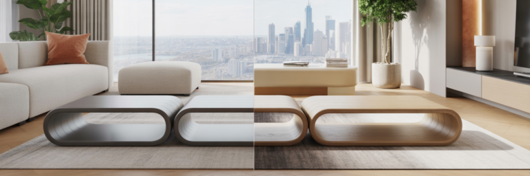
Setting the 2026 Scene
Remember when a business website was little more than a digital brochure? A static page with a phone number and maybe a map. Those days are long gone. Since the early 2020s, customer expectations across Australia have fundamentally shifted. Your website is no longer just an online listing; it’s your primary front door, your main salesperson, and the very heart of your customer experience. Whether someone is trying to book a tradie in Brisbane or buy from a boutique fashion label in Melbourne, they expect a seamless, intuitive, and engaging digital interaction.
This isn’t just a trend among tech giants. It’s a widespread expectation that touches every local business. Customers who can order groceries, book flights, and stream movies with a few taps on their phone now bring that same expectation of quality to every online interaction. Your website is being judged against the best digital experiences they have every day.
The Cost of an Outdated Website
Clinging to an old website isn’t just a matter of looking dated; it has tangible commercial consequences. An outdated site often translates to a poor mobile experience, which is a critical failure when so many customers are searching on the go. Think about it: if your site is slow to load on Australian mobile networks or impossible to navigate on a phone screen, potential customers will simply hit the back button. That’s a lost lead before you even had a chance.
This leads to a higher bounce rate, which is a clear signal to search engines like Google.com.au that your site isn’t meeting user needs. The result? Your rankings fall, and you become harder to find. For any company focused on small business website design Australia, this is a direct hit to the bottom line. Every potential customer who can’t find you or gives up on your site is revenue walking out the door.
From Passive Viewing to Active Engagement
The core shift is from passive information consumption to active, dynamic engagement. A modern website doesn’t just present information; it invites interaction. It asks questions, adapts to the user, and creates a memorable experience. According to an analysis by WP Creative, this move towards dynamic user experiences is a defining feature of contemporary web design. The trends we’re about to explore are not just cosmetic touch-ups. They are strategic tools designed to build relationships, hold attention, and guide customers toward a specific action.
A Quick Look at What’s Ahead
So, how do you turn your digital brochure into a dynamic engagement hub? We’ll be looking at several key trends that are shaping the web in 2026. We’ll cover the sophisticated appeal of dark mode, the immersive power of 3D visuals, the smart adaptability of AI-driven interfaces, and the clean organisation of bento grids. Each of these trends offers a solution to the challenge of capturing and retaining customer attention. Understanding what a modern digital presence requires is the first step, and exploring the range of professional web services we offer can provide a clear picture of what’s involved in a successful overhaul.
Mastering Mood with Sophisticated Dark Mode

Beyond a Simple Toggle
For years, dark mode was seen as a simple user preference, a toggle to flip for late-night browsing. By 2026, it has matured into a powerful branding tool. For creative agencies, luxury brands, and any business where visuals are paramount, a well-executed dark theme conveys sophistication and allows high-quality imagery and video to pop. It’s no longer just a feature; it’s a deliberate choice about the mood and premium feel you want your digital space to evoke. It tells your visitors that you care about the details.
The Nuance of ‘Dark’: Charcoal Over Pure Black
Here’s a detail that separates the amateurs from the pros: avoiding pure black (#000000). While it might seem like the most logical choice, a pure black background creates high contrast with white text, which can cause a visual distortion known as halation, or a ‘smearing’ effect that strains the eyes. Instead, modern design favours deep charcoal or off-black tones, like #121212. This subtle shift dramatically reduces eye strain, creates a sense of depth, and makes it easier to achieve accessible colour contrast ratios. It feels less harsh and more refined.
Implementing with Semantic Colour Tokens
If you’re discussing a redesign with a developer, here’s some language that will help you get the best result. Ask them about how to implement dark mode using semantic colour tokens. Instead of hardcoding colours like `background-color: #121212;`, a modern approach uses CSS variables like `background-color: var(–surface-1);`. This means colours are defined by their function (`surface`, `text-primary`, `brand-accent`) rather than their specific value. This small change makes managing themes incredibly simple and ensures that your site can maintain proper WCAG contrast ratios across both light and dark modes without a massive headache.
When Dark Mode Works Best (and When It Doesn’t)
A dark theme isn’t a universal solution. It excels in certain contexts. It’s perfect for digital portfolios, where it makes creative work the hero. It’s also highly effective for SaaS dashboards and developer tools, where users spend long hours focused on the screen. However, it can be a poor choice for text-heavy sites like blogs or news outlets, where long-form reading can become fatiguing. It can also be tricky for e-commerce sites with a wide variety of product colours that might clash with a dark background. As design resources from Figma highlight, the best approach is thoughtful and context-aware, not a one-size-fits-all gimmick.
| Factor | Old Approach (Pre-2024) | Modern Approach (2026) |
|---|---|---|
| Background Colour | Pure Black (#000000) | Off-Black/Deep Charcoal (#121212) |
| User Experience | Can cause eye strain and text ‘halation’ | Reduces eye strain, improves readability |
| Implementation | Hardcoded hex values in CSS | Semantic colour tokens (e.g., `var(–surface-color)`) |
| Accessibility | Often fails contrast ratio checks | Designed to meet WCAG standards easily |
| Brand Perception | Seen as a simple feature or gimmick | Conveys sophistication and premium quality |
Bringing Your Products to Life with 3D and Motion
The New Dimension of Online Shopping
Static product images are quickly becoming a thing of the past. Thanks to technologies like WebGL, interactive 3D for websites is transforming the online shopping experience from a flat, two-dimensional catalogue into an immersive, hands-on interaction. Imagine a customer in Perth being able to rotate a handcrafted leather bag from a Byron Bay artisan, examining the stitching and texture from every angle. Or a Sydney homeowner using augmented reality to see how a new piece of furniture would look in their living room. This isn’t science fiction; it’s the new standard for e-commerce, bridging the gap between online browsing and the tangible confidence of an in-store purchase.
Guiding the Eye with Purposeful Micro-animations
Beyond large-scale 3D models, motion is being used in more subtle, functional ways. Micro-animations are small, purposeful animations that provide feedback and guide the user’s attention. Think of a button that subtly changes shape when you hover over it, or a menu that slides smoothly into view. These aren’t just decorative flourishes. They make an interface feel responsive and intuitive. A report on UI trends from MediaPlus highlights a key best practice: keeping transition durations between 150ms and 300ms. Anything faster feels jarring, and anything slower feels sluggish. This precise timing creates a sense of seamless interaction without frustrating the user.
Boosting Engagement and Dwell Time
So, what’s the business case for all this movement? It comes down to engagement. Interactive elements and thoughtful animations make a website more interesting and enjoyable to use. When users are actively engaged—spinning a product, clicking on animated elements—they spend more time on your page. This increased “dwell time” is a powerful positive signal to search engines. It indicates that your site provides a valuable experience, which can contribute to better search rankings over time. It turns passive scrolling into active exploration, keeping potential customers on your site longer and increasing the likelihood of a conversion.
Getting Started Without a Hollywood Budget
The idea of creating 3D assets and animations might sound intimidating and expensive, but it doesn’t have to be. You don’t need a blockbuster budget to get started. Small businesses can begin with simple, effective CSS animations for buttons and page transitions. Many modern e-commerce platforms also have built-in support for 3D model viewers, allowing you to upload a 3D file just as you would a standard image. The key is to see it as an incremental upgrade. Start small, measure the impact, and build from there. For those looking to find the right tools, exploring our curated selection of design and development software can be a great place to start your journey.
Adaptive Interfaces Driven by Smart AI

Moving Beyond One-Size-Fits-All
For decades, websites have been static, presenting the same content to every visitor regardless of who they are or where they came from. AI website personalisation is changing that by enabling what’s known as adaptive architecture. Instead of a single, rigid layout, the website dynamically reconfigures itself based on user data, behaviour, and context. It’s about creating a unique journey for each visitor, making the experience more relevant and effective. The goal is to make every user feel like the site was designed just for them.
Practical Examples of AI in Action
This might sound complex, but the applications are surprisingly practical for Australian businesses. Imagine a coffee roaster’s website that detects a visitor from Victoria and automatically changes its headline to “Melbourne’s Favourite Coffee Blend.” Or consider an online clothing store that identifies a user arriving from an Instagram campaign for a specific dress; it could greet them with a tailored call-to-action like “Shop the Look You Loved.” It can also be as simple as reordering products on a category page to show items a user has previously viewed. These small, smart adjustments make the user’s journey feel more intuitive and personal.
The Measurable Impact on Conversions
This isn’t just about creating a “nice” experience; it’s a powerful driver of business results. When content and offers are more relevant, users are more likely to convert. A recent report from Meerako suggests that even basic personalisation can lead to significant performance lifts, with some businesses seeing conversion rates increase by 15-30%. By removing friction and showing customers what they are most likely to be interested in, you are directly streamlining the path to purchase. This makes AI personalisation one of the most commercially impactful trends a business can adopt.
Ethical Considerations and Building Trust
Of course, the use of personal data comes with responsibility. The key to ethical personalisation is transparency and genuine value. Customers are generally happy for their data to be used if it results in a better, more efficient experience. Be clear in your privacy policy about what data you collect and how you use it. Focus on changes that are genuinely helpful, not creepy. The data powering these features also needs a secure and reliable foundation. This is where robust solutions like our secure cloud storage become essential, ensuring that you can manage user information responsibly and maintain the trust you’ve worked so hard to build.
Organising Information with Bento Grids and Glassmorphism
Tidying Up Your Digital Space with Bento Grids
How do you present a lot of different information on a single screen without it feeling cluttered and overwhelming? The answer gaining popularity is the bento grid website layout. Inspired by Japanese bento boxes, this design approach uses a compartmentalised, card-based grid to neatly organise diverse content. Unlike a rigid, symmetrical grid, a bento grid is often asymmetrical, with different-sized containers to create a visual hierarchy. This allows you to showcase a mix of services, testimonials, blog posts, and calls-to-action in a way that feels organised, scannable, and visually engaging.
Adding Depth with Glassmorphism
Working in tandem with bento grids is the trend of glassmorphism. This is a visual effect that mimics the look of frosted glass, creating a sense of depth and layering on the page. It’s achieved in CSS using the `backdrop-filter` property, which applies a blur effect to whatever is behind the element. This subtle translucency helps separate different layers of the interface, making it clear what is in the foreground and what is in the background. It adds a touch of modern elegance and helps focus the user’s attention on key interactive elements.
The Perfect Pairing for Information-Dense Sites
When combined, bento grids and glassmorphism are a powerful duo for information-dense websites, such as those for service businesses, agencies, or SaaS companies. The grid provides the underlying structure, neatly organising the content, while glassmorphism adds a layer of visual sophistication and hierarchy. As noted by the team at Seamonster Coding, this combination is highly effective for creating interfaces that are both visually rich and easy to navigate. It allows a business to elegantly present its unique offerings, much like how a practical guide to custom furniture details bespoke solutions for a specific need, all within a clean, organised framework.
Maintaining Accessibility and Readability
While these trends are visually appealing, they must be implemented with care to ensure the site remains usable for everyone. The biggest pitfall with glassmorphism is creating poor contrast between text and the background. It’s crucial to avoid excessive translucency and to always test text elements to ensure they meet WCAG contrast standards. The goal is to create a beautiful design that doesn’t sacrifice readability. A stunning website that is difficult to read is ultimately a failed design. Functionality and accessibility must always come first.
Your Practical Roadmap for a Website Refresh

Feeling inspired but not sure where to start? Adopting new design trends doesn’t have to be an overwhelming process. Here is a practical, step-by-step roadmap to guide your website refresh.
-
Step 1: Audit Your Current Digital Presence.
Before you change anything, you need to know what’s working and what isn’t. Start by looking at your website analytics. Identify your most visited pages, where users spend the most time, and, most importantly, where they drop off. This data-driven approach gives you a clear baseline and helps you understand your users’ current behaviour. Don’t guess; use the data you already have.
-
Step 2: Prioritise Trends Based on Your Business Goals.
Not all web design trends 2026 Australia will be right for your business. The key is to choose strategically. Are you an e-commerce store? Then interactive 3D visuals should be a high priority. Are you a local service provider? AI-driven geo-targeting could give you a significant edge. A creative agency? A sophisticated dark mode might be perfect. Choose one or two trends that directly align with your primary business objectives and will have the biggest impact on your customers.
-
Step 3: Plan the Implementation – DIY vs. Professional Help.
Now, consider how you’ll bring your vision to life. Some simpler changes, like tweaking colours or using a new layout template, might be achievable with your existing website builder. However, more complex features like AI personalisation or custom 3D viewers will likely require a developer. This is where an all-in-one platform like Digital Fusion Hub can be invaluable, simplifying development, design, and hosting to save you time and hassle. If you decide you need expert guidance to get it right, don’t hesitate to get in touch with professionals who can help.
-
Step 4: Test, Measure, and Iterate.
Finally, remember that a website is never truly ‘finished’. Once you’ve launched your changes, the work isn’t over. Monitor your analytics to see how the changes have affected user behaviour. Are people spending more time on the site? Have conversion rates improved? Gather user feedback through surveys or direct conversations. Use this information to make continuous, incremental improvements. This iterative process is what ensures your website remains effective and relevant for the long term.