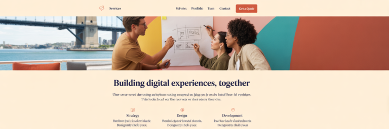
In an environment of shrinking attention spans, the most effective websites are those that solve user problems with speed and clarity. The conversation around web design trends in 2026 has shifted decisively away from fleeting aesthetics towards intentional, performance-driven results. This principle applies equally to a tradie in Brisbane needing to showcase their services and a cafe in Melbourne wanting to display its menu. The core function of a business website is to communicate its value proposition almost instantly.
This marks a significant move away from purely decorative elements that add no functional value. For Australian businesses, every component on a page must earn its place. It must either contribute to the user’s understanding or guide them towards a specific goal. We can no longer afford to have visual clutter that slows down the user journey or obscures the primary message. A website is a tool for business, and its design must reflect that with ruthless efficiency.
This focus on clarity introduces the need to design for a dual audience: human visitors and AI agents. Clean, structured design is critical not just for a person’s readability but also for the search engine crawlers and artificial intelligence tools that index your site. As a report from IONOS highlights, future designs must cater to AI agents to remain competitive. This directly impacts your digital visibility and search engine ranking, making it a commercial necessity rather than a simple design choice.
The following sections explore the trends that support this new foundation. We will look at principles focused on user-centricity, speed, accessibility, and intelligent personalisation. These are not fads but foundational pillars for creating a valuable and less frustrating online experience. Integrating these modern principles is central to effective small business website design Australia, a philosophy that underpins the comprehensive digital solutions we offer to help businesses achieve their goals.
AI-Driven Personalisation and Interfaces
The term AI website personalisation can sound intimidating for a small business owner, but the concept is straightforward. It is about using technology to anticipate a user’s needs and show them the most relevant content, making them feel understood from the moment they arrive on your site. This moves beyond a one-size-fits-all approach and creates a more tailored and effective user journey.
Practical AI Personalisation for Small Businesses
At its core, personalisation means your website adapts to the visitor. Imagine a website for a camping gear store. Using simple data points like location, it could show a visitor from Tasmania advertisements for thermal base layers and cold-weather sleeping bags. At the same time, a visitor from Darwin might see promotions for lightweight, tropical-rated tents and mosquito nets. This is not about complex algorithms but about using available information to be more helpful. The goal is to make the user’s experience feel intuitive and relevant, reducing the time they spend searching for what they need.
Predictive Navigation: Guiding the User Journey
Building on this idea, AI can analyse user behaviour to suggest the most likely next pages or actions. If a visitor has spent time on your “About Us” page and then viewed a specific service, the system might proactively highlight a relevant case study or a “Book a Consultation” button. This predictive navigation simplifies the customer journey, making the website feel responsive and intelligent. By anticipating needs, you can significantly reduce bounce rates and guide visitors towards conversion. This is a powerful method for how to improve user experience without being intrusive.
The Rise of Proactive, Conversational Interfaces
AI chatbots have also evolved far beyond simple question and answer bots. As noted in design resources from platforms like Figma, modern conversational interfaces can guide users through complex processes, offer tailored support, and even complete transactions within the chat window. However, the key is to maintain a human touch. It is vital to ensure your AI has a distinct personality that aligns with your brand and provides an easy, obvious escalation path to a real person. A customer should never feel trapped by a robot. The AI is there to assist, not to create a barrier.
Implementing these features does not require a massive budget. Businesses can start by using smart analytics to understand user behaviour and then leverage AI-powered tools for content recommendations. For more advanced capabilities, exploring solutions like our Ai Cloud Services can provide the necessary power without the need to build systems from scratch, making this technology accessible to everyone.
Clarity-Driven Structures and Redefined Minimalism
In 2026, the most effective web design principle is that clarity trumps clutter. Users have limited time and even less patience for confusing layouts. A successful website communicates its purpose immediately, guiding the visitor without friction. This is achieved through a strategic approach to structure and a modern interpretation of minimalism that prioritizes function over form.
Embracing the ‘TL;DR Experience’
The “Too Long; Didn’t Read” culture of the internet is not a sign of laziness but a demand for efficiency. A clarity-driven design embraces this by structuring a webpage to deliver the most critical information instantly. The core value proposition, what you do, and what action you want the user to take should be understood within seconds of the page loading. Deeper content, detailed explanations, and secondary information should always be available for those who want it, but it should not be a barrier to understanding the basics. This respects the user’s time and ensures your key message is never missed.
Redefining Minimalism: Intentionality Over Emptiness
Modern minimalism is not about creating vast, empty white spaces for a sterile aesthetic. It is the intentional practice of removing every non-essential element to allow the key message and call-to-action to shine. For a small business, this means a ruthless focus on what solves the customer’s problem. Every headline, image, and button has a job to do. If an element does not contribute to clarity or conversion, it is a distraction. This principle of stripping back to the essential is not unique to web design. A similar philosophy can be seen in other creative fields, such as the thoughtful approach to minimalist tattoos in Singapore, where every single line has a distinct purpose and meaning.
The Strategic Role of Kinetic and Bold Typography
When visual elements are reduced, typography becomes a primary design tool. In a minimalist framework, kinetic and bold typography is used strategically to direct attention, establish brand personality, and create a visual hierarchy. Large, confident headings tell the user what is most important, while well-chosen body fonts ensure readability. This is not just about making text look good. It is about using text as a structural element that guides the user’s eye logically through the content, from the main message to the final call-to-action.
To achieve this clarity, you can audit your homepage with a simple test. Ask someone who is unfamiliar with your business to look at it for five seconds. Can they tell you what you do and why it matters? If not, your message is not clear enough. Use unambiguous headings, concise copy, and a single, primary call-to-action on each page to ensure your website works as hard as you do.
| Principle | Old Minimalism (Aesthetic-Driven) | New Minimalism (Clarity-Driven) |
|---|---|---|
| Use of Space | Often large, empty white spaces for a ‘clean’ look. | Whitespace is used intentionally to separate elements and create focus. |
| Typography | Thin, light fonts, often low-contrast. | Bold, high-contrast typography used as a primary visual element. |
| Colour Palette | Monochromatic or muted palettes. | Can be monochromatic or use bold accent colours to guide the eye. |
| Primary Goal | Achieve a specific aesthetic or ‘less is more’ style. | Remove all distractions to make the core message and CTA unmissable. |
Immersive 3D Visuals with a Performance Budget

Immersive 3D visuals and WebGL technology are transforming how businesses showcase their products online. These tools allow for interactive, engaging experiences that were once the exclusive domain of high-end video games. However, their implementation comes with a critical condition: they must not compromise website performance. In 2026, the challenge is to deliver these rich visuals within a strict performance budget.
The Power of 3D for Product Visualisation
For businesses with physical products, 3D visualisation is a powerful sales tool. It allows customers to interact with items in a way that static images cannot replicate. For example, a Sydney-based furniture maker can let a customer view a custom timber table from all angles, zoom in on the wood grain, and even see how it looks in different lighting conditions. Similarly, a Gold Coast property developer can offer a virtual 3D walkthrough of a new apartment, giving potential buyers a true sense of the space before it is even built. As seen in live demos and examples from design experts like Gezar, these experiences build confidence and drive conversions.
The Critical ‘Performance Budget’
These impressive visuals come at a cost in data and processing power. A slow-loading website is one of the primary causes of user frustration and abandonment. This is especially true in Australia, where mobile network speeds can be notoriously variable between regional and metropolitan areas. Therefore, every 3D element must be justified by its value and optimised to load quickly. This is a non-negotiable aspect of how to improve user experience. A stunning 3D model that takes ten seconds to load is not an asset, it is a liability.
Smart Loading Strategies and Micro-interactions
To balance immersion with performance, developers use smart loading strategies. One common technique is “lazy loading,” where a 3D model or large image only begins to load when the user scrolls down to that part of the page. Another is providing “static fallbacks,” where a simple, fast-loading image is shown on older devices or slow connections, ensuring the core experience is never broken. This approach enhances the experience for those who can support it without penalising those who cannot.
Micro-interactions also play a role. These are small, subtle animations that provide helpful feedback, such as a button that changes colour when clicked or a gentle pulse on a notification icon. When used sparingly, they confirm a user’s actions and make the interface feel more responsive without being distracting. Delivering these large assets and smooth interactions requires a robust foundation. Using a reliable cloud storage solution is fundamental to ensuring your website can deliver a seamless 3D experience without slowdowns.
Dark Mode and Dynamic Visual Hierarchies
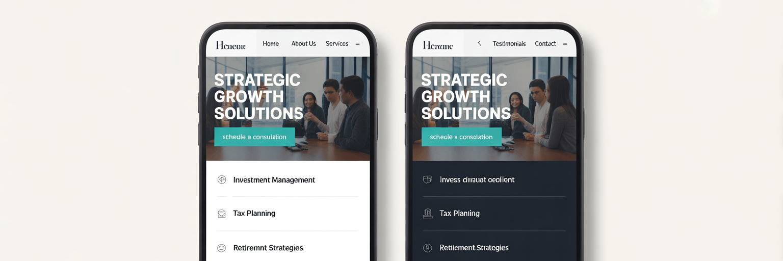
Dark mode has evolved from a niche preference for developers to a standard feature expected by many users. Its widespread adoption on operating systems and popular apps means that websites are now expected to follow suit. Implementing dark mode correctly is not just about aesthetics, it is about user comfort, accessibility, and thoughtful design.
The primary benefits of dark mode are well-established. It can significantly reduce eye strain in low-light environments, making content more comfortable to read at night. For devices with OLED screens, which are now common in modern smartphones, it can also lead to improved battery life because black pixels are turned off, consuming less power. These practical advantages have made it a user-centric feature that businesses can no longer ignore.
A proper implementation of dark mode is seamless. Modern web development uses a simple media query known as `prefers-color-scheme`. This piece of code allows a website to automatically detect if the user’s device is set to light or dark mode and apply the appropriate theme without any user input. However, it is crucial to warn against the lazy approach of simply inverting colours. This can destroy legibility, misrepresent brand colours, and create major accessibility issues. A well-designed dark theme requires careful consideration of contrast and colour theory.
This connects dark mode to the broader concept of creating dynamic visual hierarchies. A good dark theme is not just a black background with white text. It uses varying shades of grey and carefully chosen accent colours to ensure that the most important elements, like headlines and buttons, stand out. The goal is to maintain a clear and easy-to-navigate structure, regardless of the colour scheme. This attention to detail is a hallmark of professional design. For more expert tips on creating effective and user-friendly websites, you can always browse our blog.
As a best practice, it is always wise to offer a user-controlled toggle that allows visitors to switch between light and dark modes manually. This gives them ultimate control over their experience. Finally, businesses must test all visual elements, including logos, images, and icons, to ensure they look great on both light and dark backgrounds. This ensures a consistent and professional brand presentation for every visitor.
Making Accessibility a Foundational Requirement
Web accessibility is no longer an optional extra or an afterthought. It is a non-negotiable, foundational requirement of professional web design. The core principle is simple: ensuring that everyone, including the over 4.4 million Australians living with some form of disability, can use and navigate your website effectively. This is not just a matter of compliance, it aligns with the fundamental Australian value of giving everyone a “fair go”.
Beyond the ethical imperative, there is a compelling business case for accessibility. A more accessible site naturally reaches a wider audience. It also tends to perform better in search engine rankings, as crawlers favour well-structured, semantic websites that are easy to interpret. Furthermore, many of the practices that improve accessibility, such as clear navigation and readable text, enhance the user experience for all visitors, not just those with disabilities. It is a practice that benefits everyone.
The global standard for web accessibility is the Web Content Accessibility Guidelines (WCAG). While the full guidelines can seem intimidating, the core principles are straightforward. For any business wanting to implement accessible web design WCAG principles, it is best to start with the basics. For those who wish to learn more, the official W3C provides an excellent introduction to web accessibility. The table below breaks down the four main principles into simple, practical terms.
| WCAG Principle | What it Means in Simple Terms | A Simple Action You Can Take |
|---|---|---|
| Perceivable | Users must be able to perceive the information being presented (it can’t be invisible to all of their senses). | Add descriptive alt text to all important images so screen readers can describe them. |
| Operable | Users must be able to operate the interface (the interface cannot require interaction that a user cannot perform). | Ensure your entire website can be navigated using only a keyboard (tab, shift+tab, enter). |
| Understandable | Users must be able to understand the information as well as the operation of the user interface. | Use clear, simple language. Avoid jargon and ensure error messages are helpful (e.g., ‘Please enter a valid email address’). |
| Robust | Content must be robust enough that it can be interpreted reliably by a wide variety of user agents, including assistive technologies. | Use proper HTML structure (e.g., use H1 for main titles, H2 for sections) to create a logical document outline. |
The most effective approach is to build accessibility in from the very start of any web design project. Retrofitting an existing site to be accessible is far more difficult and costly than planning for it from day one. This proactive mindset is a core part of the professional, user-centric approach that we champion at Digital Fusion Hub.
Sustainable Design for a Faster, Greener Web
An important emerging trend is sustainable web development. This concept involves creating websites that are designed to use less energy, thereby reducing their digital carbon footprint. With a growing environmental consciousness among Australian consumers and businesses, demonstrating a commitment to sustainability can be a powerful brand differentiator. It shows that your business is thoughtful about its impact on the world.
There is a direct and powerful link between sustainability and performance. The very same techniques used for sustainable design are those that make a website load faster and perform better. This includes writing cleaner code, compressing images and other assets, using efficient hosting, and removing unnecessary scripts that consume processing power. A sustainable website is, by its nature, an efficient website.
The business benefits are clear. Faster sites lead to lower bounce rates, higher conversion rates, and a better overall user experience. A lean, efficient site is also perceived as more professional and reliable. The environmental impact is also significant. According to resources like the Website Carbon Calculator, the internet’s collective carbon footprint is comparable to that of the entire airline industry. Every kilobyte saved contributes to a greener web.
Here are a few simple, actionable steps you can take to make your website more sustainable:
- Compress all images before uploading them to your site. This is one of the easiest and most impactful changes you can make.
- Choose an efficient and reliable web host, ideally one that uses or invests in renewable energy to power its data centres.
- Regularly audit your site to remove outdated plugins, unused code, and redundant pages that consume server resources.
- Minimise the use of auto-playing videos, which are extremely data-intensive and often annoy users.
Choosing the right infrastructure is key to achieving these efficiencies. Exploring the features of a modern cloud storage solution can reveal significant benefits in performance and energy consumption, helping you build a faster and more sustainable online presence.
An Actionable Checklist for Your Business Website

Feeling inspired but not sure where to begin? Do not try to implement everything at once. Instead, use this practical checklist to take the first steps toward modernising your website. Small, focused improvements can make a big difference.
- Audit for Speed and Clarity: Start with the fundamentals. Use some of the free tools available online to test your site’s load time. Then, ask a friend or colleague to look at your homepage for five seconds and explain what your business does. If they struggle, your clarity needs work.
- Review Accessibility Basics: This is a simple but high-impact step. Use an online contrast checker to ensure your text is readable against its background. Go through your key pages and make sure every meaningful image has descriptive alt text. This is a great first step towards WCAG compliance.
- Identify One High-Impact Trend: Choose one trend from this article that would most benefit your specific customers. For a furniture store, it might be 3D product views. For a service business, it might be improving the layout for absolute clarity. Focus on implementing that one thing well.
Transforming your small business website design Australia into a modern, effective asset is a journey. If you need a partner to help you navigate these trends and build a website that delivers results, please get in touch with us.