

The Foundation of 2026 Web Design Trends: Machine Experience
A website in the early 2000s was little more than a static digital flyer, a fixed brochure floating in cyberspace. Fast forward to 2026, and a high-performing website is an intelligent engine for business growth, actively working to attract and convert customers. The most important web design trends 2026 are not just about visual flair. They are built on a critical balance between expressive, human-focused design and a clean, machine-readable technical structure. Success now lies in mastering both sides of this equation.
This brings us to a foundational concept: Machine Experience (MX). This is no longer just about optimising your site for Google’s traditional crawlers. MX is about structuring your website’s code and content so that a new generation of AI tools, including conversational search engines and automated data analysis agents, can easily understand, interpret, and accurately represent your information. As highlighted in a recent analysis by WebDigitalDevelopment, AI search agents are changing how content is discovered. A strong MX is therefore essential for maintaining discoverability and authority in an increasingly AI-driven digital world.
Mastering MX involves several core components that are simpler than they sound. First is the use of Semantic HTML. Think of this as using the right ‘labels’ for your content. Instead of wrapping every element in a generic container, specific tags like <article>, <section>, and <nav> tell machines precisely what each part of the page is for. This creates a clear and logical map for any automated system to follow.
Building on this is a Logical Heading Hierarchy. Using H1, H2, and H3 tags correctly creates a clear outline of your content, much like a table of contents in a book. It signals the structure and relative importance of information, allowing both users and machines to quickly grasp the main points of a page without reading every word.
Finally, Schema Markup adds another layer of context. This involves adding specific ‘context labels’ to your content that explicitly tell an AI what it is looking at. For example, you can mark up a string of numbers as a phone number, a block of text as a product description, or an address as a physical business location. For effective small business website design Australia, this is incredibly powerful. A local provider, like a dental studio offering specific treatments such as teeth whitening, can structure its page so AI understands exactly what service is offered, its benefits, and its price. This ensures your business is accurately represented in complex search queries.
Underpinning all of this is a performance-first mindset. In 2026, site speed is a fundamental conversion metric. Slow websites directly hurt your bottom line by frustrating users and being penalised by algorithms. Optimising images, code, and server response times is a non-negotiable first step. This is where having a partner that handles both design and hosting is a significant advantage, ensuring all technical elements are aligned for peak performance through our comprehensive digital services.
Harnessing AI for Personalised and Adaptive Interfaces

While Machine Experience refines your website’s backend for AI crawlers, the next major trend uses AI to transform the user-facing experience. We are moving away from the era of static, one-size-fits-all websites and into a new age of truly adaptive interfaces. These smart websites analyse user behaviour in real-time, considering factors like pages visited, time on page, location, and even the time of day. With this data, they can dynamically alter the layout, content, and calls-to-action to match an individual user’s immediate intent.
This evolution is powered by what are known as ‘agentic AI tools’. As described in a MockFlow blog on UI design trends, these are far more advanced than the simple chatbots of the past. They are goal-oriented assistants embedded within a website, designed to understand complex requests and take action. Imagine a user on an Australian travel site typing, ‘plan a relaxing 5-day trip to the Blue Mountains for two under $2000’. Instead of just returning a list of links, the AI agent would assemble a complete itinerary with accommodation, dining, and activity options that fit the criteria. This is the essence of AI website personalisation.
The practical applications for Australian small businesses are immense and immediately valuable. A local cafe’s website could automatically adapt to show its lunch specials to a user visiting around midday. A tradie’s site could prominently highlight its ‘24/7 Emergency Services’ for someone searching after 6 PM on a weeknight. This makes the website feel less like a static digital brochure and more like a helpful, intuitive employee who anticipates customer needs. The experience becomes hyper-relevant, guiding the user towards the exact solution they are looking for at that moment.
Of course, this level of personalisation comes with important ethical considerations. To build and maintain customer trust, businesses must be completely transparent about their data collection and usage practices. Compliance with Australian privacy laws is not just a legal requirement but a cornerstone of building strong, lasting customer relationships. When implemented ethically, AI-driven personalisation is not about intrusive tracking. It is about delivering genuinely helpful experiences that respect user privacy while driving conversions. Integrating these complex features requires a unified approach, which is why our all-in-one digital platform is designed to manage these elements seamlessly.
Functional 3D and Purposeful Micro-interactions
For years, 3D elements on the web were often seen as flashy gimmicks that slowed down websites without adding real value. That perception has changed completely. In 2026, functional 3D is a powerful tool that drives engagement and sales, especially in e-commerce. An interactive e-commerce 3D product viewer allows customers to inspect an item from every angle, zoom in on textures and materials, and even configure colours or features in real-time. This ability to digitally ‘handle’ a product tangibly reduces purchase hesitation and bridges the gap between online and in-person shopping.
Research from sources like DesignRush has shown that interactive 3D models can significantly boost conversion rates. While the technology behind it, such as WebGL, is complex, modern development frameworks now allow for these immersive experiences without crippling page load times. The key is finding the right balance between visual enhancement and site performance, a core principle of excellent web design. It’s about using 3D with purpose, not just for decoration.
Complementing these larger immersive features are micro-interactions. These are small, purposeful animations that provide feedback and guide the user through an interface. It is crucial to understand that these are functional, not merely decorative. They serve a specific purpose in making a website feel more responsive and intuitive. Clear examples include a button that subtly changes shape or colour to confirm it has been pressed, a loading animation that shows genuine progress to reduce user anxiety, or a gentle shake animation on a form field where an incorrect password was entered.
The power of these small details accumulates to create a polished and trustworthy experience. When a user adds an item to their cart, the cart icon might wiggle and display the updated item count. This simple animation confirms the action was successful without a disruptive page reload or a distracting pop-up. It’s a quiet, reassuring nod to the user. These thoughtful touches make an interface feel alive and reliable, building user confidence with every click. For businesses looking to showcase their products effectively, integrating these features is a natural fit for our e-commerce solutions.
The Clarity of Bento Grids and Minimalist Layouts
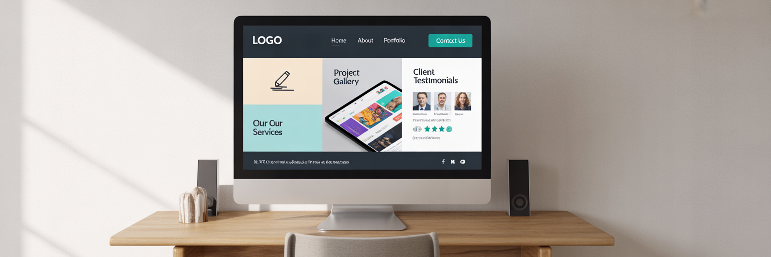
One of the most practical and visually appealing layout trends is the ‘bento grid’. The name comes from the Japanese bento box, where different foods are neatly separated into individual compartments. On a website, this translates to a grid of rectangular or square tiles, each containing a distinct, self-contained piece of information. You might see bento grid layout examples where one tile features a key service description, another displays a client testimonial, a third links to a case study, and a fourth shows a call-to-action. This modular approach is gaining traction for good reason, as noted by industry observers like Elcom.
This layout is particularly effective for how users behave in 2026. It is inherently mobile-friendly, as the tiles can be easily stacked or rearranged to fit smaller screens without breaking the design. More importantly, it caters to modern users who scan content quickly. Instead of being confronted by a wall of text, visitors can immediately identify the sections that are most relevant to them and focus their attention there. The bento grid organises information into digestible, bite-sized chunks, making the user’s journey more efficient and less overwhelming.
The bento grid also connects directly back to the concept of Machine Experience (MX) we discussed earlier. The clear separation of content into distinct, labelled modules makes it incredibly easy for AI agents and search crawlers to parse the structure and relative importance of information on a page. Each tile acts as a neatly packaged piece of data, simplifying interpretation for automated systems.
This trend is part of a broader movement towards strategic minimalism. In 2026, a minimalist design is a business decision, not just an aesthetic preference. Clean layouts with generous white space, clear typography, and a focused content hierarchy achieve several key goals. They improve readability, making your message easier to absorb. They reduce cognitive load for users, which makes it easier for them to process information and make a decision. Finally, they contribute directly to faster page load times by eliminating unnecessary elements. The core idea is to remove every distraction, making your primary call-to-action impossible to miss. For more insights on design and information architecture, you can explore our blog.
Accessibility and Sustainability as Core Design Principles
In 2026, web accessibility is not an optional extra or a niche concern. It is a fundamental, non-negotiable requirement for any modern Australian business. Consider this: approximately 1 in 6 Australians live with some form of disability. An inaccessible website is not just a technical oversight; it is a commercial failure that actively excludes a significant portion of your potential market. This makes accessibility-first web design a business imperative, not just a matter of compliance.
The Web Content Accessibility Guidelines (WCAG) can seem daunting, but the core principles are straightforward. Key concepts include:
- Mandatory Focus States: This is a clear visual indicator, like a border or highlight, that shows which element is currently selected when a user navigates with a keyboard instead of a mouse.
- High-Contrast Palettes: This ensures that all text is clearly readable against its background, which is essential for users with low vision and beneficial for everyone in different lighting conditions.
- Keyboard-Only Flows: The entire site, including menus, forms, and pop-ups, must be fully usable without a mouse. This is critical for users with motor disabilities.
- Descriptive Alt Text: Every meaningful image must have a useful text description so that screen reader users can understand the visual content.
The business case for accessibility is undeniable. It expands your audience, improves SEO because search engines can better understand well-structured content, and builds significant brand loyalty and positive public perception. Unfortunately, as reports from sources like Digilite show, a vast number of websites still fail basic accessibility tests. To help you get started, here is a mini-audit checklist.
| Accessibility Principle | What to Check on Your Website | Why It Matters for Your Business |
|---|---|---|
| Contrast Ratios | Is all text easily readable against its background? Use a contrast checker tool. | Reaches users with visual impairments and improves readability for everyone. |
| Keyboard Navigation | Can you navigate the entire site, including menus and forms, using only the Tab key? | Essential for users with motor disabilities and a power-user feature. |
| Image Alt Text | Does every meaningful image have a descriptive alt tag that explains its content? | Crucial for screen reader users and improves image SEO. |
| Semantic HTML | Does your code use tags like <nav>, <main>, and <button> correctly? | Helps search engines and assistive technologies understand your site’s structure. |
This table provides a starting point for Australian small businesses to evaluate the accessibility of their website. Each principle directly impacts user experience and has a clear business benefit. If you need help implementing these changes, feel free to contact our team for professional guidance.
Alongside accessibility, sustainable web design is an emerging principle. This is about creating digital products that minimise their environmental impact by reducing energy consumption. Tangible practices include optimising code, compressing images, using efficient system fonts, and offering a ‘dark mode’ feature, which can reduce screen power usage on modern OLED screens. Happily, sustainable practices almost always lead to faster performance, creating a win-win for the planet and the user experience.
The Shift Towards Voice and Multimodal Interfaces
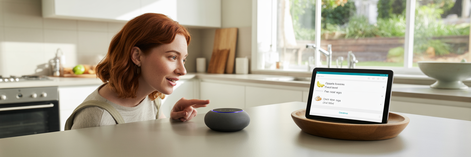
The widespread adoption of smart speakers and phone assistants has made people increasingly comfortable interacting with technology using their voice. This behaviour is now extending to how they navigate the web, giving rise to a trend known as ‘conversational navigation’. Users are starting to expect that they can speak to a website just as they would to a digital assistant. As highlighted by Network Solutions, the growth of voice UI is reshaping user expectations.
This leads to the concept of a multimodal interface. This is an interface that allows a user to seamlessly switch between different modes of interaction, such as voice, touch, and keyboard, depending on what is most convenient for them at that moment. The experience is fluid and context-aware. For a practical example, imagine a user on a recipe website. They could start by asking their device to ‘find a recipe for lamb roast’. They might then scroll through the visual results with their finger on a tablet, select a recipe, and finally say, ‘add all ingredients to my shopping list’ to complete the task without ever touching a keyboard.
So, how can an Australian business prepare its website for this audio-first engagement? The good news is that the work starts with the foundational principles we have already discussed. A website that is well-structured with semantic HTML and a logical heading hierarchy is already halfway there. This structure allows a screen reader or voice assistant to create a verbal ‘table of contents’, making the site easy to navigate via audio commands. Furthermore, using clear, natural language in your content and providing concise answers to common questions on an FAQ page are both crucial for voice search optimisation.
The future implications for local businesses are exciting. A local restaurant could allow users to book a table via a simple voice command on its website. A retailer could let customers check stock levels at their nearest store just by asking. The key takeaway is that this trend is about reducing friction and meeting customers on their terms. It makes it faster and easier for them to do business with you, which is always a winning strategy. Integrating these advanced capabilities is made simpler with a platform that provides a robust suite of features designed for modern web experiences.
Choosing the Right Trends for Your Aussie Business
After exploring these emerging trends, it is easy to feel pressured to adopt every single one. However, the goal is not to chase novelty. Implementing trends for their own sake can lead to a confusing user experience, a bloated and slow website, and a significant waste of time and resources. The most successful businesses will be strategic and selective, choosing only the trends that deliver tangible value.
Before you invest in a new feature or design overhaul, use this simple evaluation framework to guide your decision:
- Does this genuinely improve the experience for my target customer? Will it solve a real problem for them or remove a point of friction in their journey? The user should always be at the centre of the decision.
- Does it align with my core business goals? Will this trend help you generate more qualified leads, increase online sales, or provide better and more efficient customer support? Every investment should have a clear business purpose.
- Is it technically feasible and performant? Can this feature be implemented without slowing down your site or creating a maintenance nightmare? A flashy feature that breaks your site is worse than no feature at all.
A practical example makes this framework clear. A local artisan selling unique, handcrafted furniture would benefit immensely from functional 3D models, as it allows customers to appreciate the craftsmanship from all angles. In contrast, a B2B consultant whose website is primarily for lead generation and establishing authority would be better off focusing on excellent Machine Experience and a clear, accessible layout that highlights their expertise and case studies.
Ultimately, the overarching theme for web design trends 2026 is a move towards more thoughtful, efficient, and inclusive digital experiences. Prioritising clarity, speed, and accessibility will always be a better long-term investment than chasing fleeting fads. This is how you build a website that not only looks modern but also delivers real, measurable business results. Navigating these complexities can be challenging, but you do not have to do it alone. As your digital partner, we can help you strategically implement the right trends through our all-in-one services, combining cutting-edge design with solid performance and strategy.